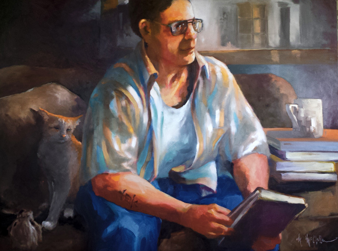
Lessons with Maggie
I rarely talk or 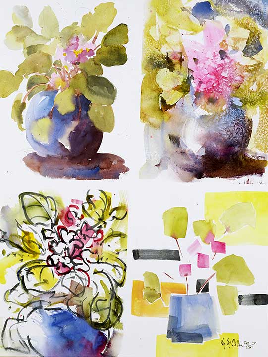 write much about my personal artistic musings, but that is changing for some reason. After many years of not being comfortable with my work, I love what I’m doing now. My time painting has been a quest for some elusive end, some look and message that never seems to materialize to my satisfaction. Now I jump headlong into the quest and have a grand time messing things up!
A bunch of well established artists (myself included) had a discussion the other day about the differences in likenesses (live model) artists get while painting the same person. I was asking how does one determine if their work is good, i.e. “right”, if so many variations of the same person are the outcome? That has brought to light something I think about all the time and encourage my students to think about it also.
If there are so many valid conceptions of the same subject, how do we determine if a painting is good, right and/or even finished?
I have been lately on a tear to redo many of my paintings; paintings that I was most probably generally content with a while back but now seem lacking somehow. This confirming the point i often make to my students….that there isn’t a right way to do anything in the creative field. The issue of wh
at’s good….well, that is in the eye of the beholder (especially a buyer) and in the soul of the artist. Andabout finishing….probably nothing, in the mind of the artist, is ever really a “finished surety”. We declare them finished, put them in shows or put a price tag on them but is it just me or do others look at their work and say: “I wonder, what if…..” Or is this just a sign of an immature artist? An artist that hasn’t gotten all her “ducks in a row” yet.
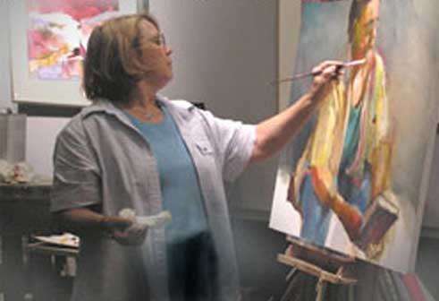
Now I wish I had known what I know about about being really painterly! I would have left it be with very little changes.
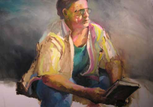
It all started with a demonstration at the Art League of Daytona Beach in Daytona, Florida. This demonstration was “live model”. .The demo started late and so I didn’t have more than 40 to 50 minutes to paint. This image (photo #2) is where it was when we quit. Actually, I had gotten my point across and was perfectly happy with the results. The model was a local gentleman (who asked that I call the painting “Hontoe” which he said is Japanese for “truth”). I loved his chiseled face, striped shirt, the quality of the lighting, etc
After returning home, I apparently felt I needed to add some shapes and interest to the painting (photo #3). So I started playing around with the composition. This is where the painting stayed for sometime while I studied the relationship of the shapes, how one moved around the painting and the harmony of color. or lack there of Either the blue of the jeans or the turquoise of the tank top proved too isolated.
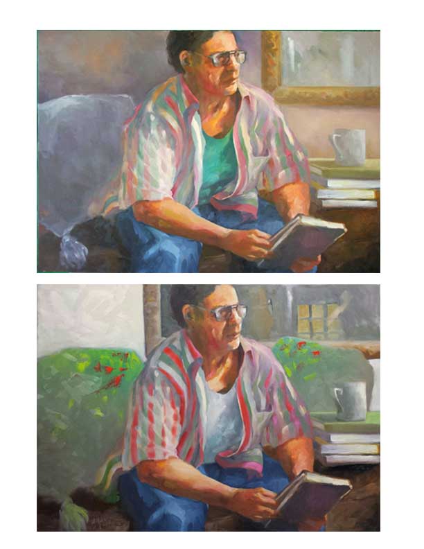 The mirror frame pressed in too much on the figure’s face and the area behind him was too empty, making the balance heavy on the right side (as you face the painting). My research had repeatedly pointed out that a painting weighing heavier on the right side can be uncomfortable for any viewer. The logical answer seemed to extend the mirror behind and past the figure’s head (photo #4). This connected the structures into a unified abstract design. In the end, it still didn’t feel “quite right”.
I debated cropping the painting (photos # 5 & 6) which did make the painting more cohesive and brought a better sense of balance and movement. I liked the bottom choice best. However, I was loathe to cut up the painting before giving all the challenges a go.
So it sat for a while longer as i pondered what to do with the vacant side behind him. Ah, an inspiration! Why not put something behind him. But what? Whatever I put there would be paramount for creating balance and interest. What about something breathing, like an animal? Would that be too kitschy? Would it make the painting “too ordinary”? Being trained as a graphic designer, I decided to play around with adding a pet behind the figure. A dog wasn’t easily incorporated into the space allowed. I tried a cat. Liked that idea, but the coloring and the cat’s expression just didn’t make the grade. Not willing to give up on the cat, it got a more harmonious color and a less saccharine expression.
I was getting very happy with the whole thing and thought it (as I had many times before) was very solid, maybe even competition grade solid. Wanting to be sure my assessment was on target, I invited very accomplished artists over to for a critique. One liked it as much as I did….the other one tore it apart! OK, what to do with that? We (meaning me) wait, we ponder, we evaluate and we decide that settling for mediocre isn’t our game plan.
But do we know that it’s only mediocre? That won’t be answered until we play some more. At this moment, a very crucial thing happened. I ran across the photo of the painting as it stood at the end of my demonstration in Daytona Beach. Looking at it was like looking at something special, something that went beyond where my painting was at this moment, something kinda magical, mysterious; a style I’ve been working towards for years.
Now’s the quandary. It would be virtually impossible to take this painting back to that point and equally as impossible to recreate the inspiration of the moment. I did decide that I could try to bring the colors into a more harmonious palette (very different for me as I’ve been all about color, color, color for years), more unifying values and light patterns. The result is not photographing as beautiful nor as dramatic as it is seeing it in person and I’m not sure that I like the blue-greenish tones. They might get neutralized a bit more towards blue grays. The journey might not be over for this piece of work. However, before digging into it more, I’m going to enter it into a few juried shows and see what the response is. I love seeing how I measure up with the best of the best….whatever that means! I’ve also learned that if work gets juried out consistently, the artist needs to look either at the quality, style, expertise level or if it fits the current show trends they are competing against. I don’t paint according to trends and my work isn’t the standard selling type of work. We’ll see what happens and where I go from here. Anyway, it’s only a journey.
As it turns out and before any jury show was available and after more input from my peers, the tweaking continued on. I suddenly saw a brush stroke on his arm that didn’t work. Instead of painting out that stoke, I added a tattoo to his right arm. The model had asked that I title his painting “Hontoe” which according to him means Truth in Japanese. I have a background in Chinese Calligraphy, so I figured I can do a reasonably good job recreating the Japanese calligraphy (for truth) on his arm (note the color compatibility of the tattoo I chose). Tattoo added….I like it! (Orange didn’t work – looked fake). Brash words were spoken aloud: “I absolutely love the painting now and think the tattoo finishs it off just fine!”
There was more input, such as: the cat is wonderful but it takes all the attention. Sooooo, back to the easel. I reduced the definition of the cat’s eyes and it’s value which caused a need to make a load of big and small changes all over the painting. Fortunately I’m on a crusade; challenging chiaroscuro, painting strong light and dark instead of focusing so much on color. Have you ever done the” find the 6 things that are different “in the comic section of a newspaper? Discovering all the changes I made between the last two photos is that kind of a challenge. How many can you find?
Now it’s time to end this journey and get on with my next escapade. Every step has it’s strengths and it’s weaknesses. It seems to all depend on what the objective is: color – value – lost & found – style – composition. I am concluding that all that plays a part. What seems to matter is the artist’s intentions, what makes that artist’s soul sing, and when the song sounds really good.
[/et_pb_text][/et_pb_column][/et_pb_row][/et_pb_section]

